Example: Sale Prices for Houses
Contents
10.6. Example: Sale Prices for Houses#
In this final section, we carry out an exploratory analysis using the questions in the previous section to direct our investigations. Although EDA typically begins in the data wrangling stage, for demonstration purposes the data we work with here have already been partially cleaned so that we can focus on exploring the features of interest. Note also that we do not discuss refining the visualizations in much detail; that topic is covered in Chapter 11.
Our data were scraped from the San Francisco Chronicle (SFChron) website. The data comprise a complete list of homes sold in the area from April 2003 to December 2008. Since we have no plans to generalize our findings beyond the time period and the location and we are working with a census, the population matches the access frame and the sample consists of the entire population.
As for granularity, each record represents a sale of a home in the SF Bay Area during the specified time period. This means that if a home was sold twice during this time, then there are two records in the table. And if a home in the Bay Area was not up for sale during this time, then it does not appear in the dataset.
The data are in the data frame sfh_df:
sfh_df
| city | zip | street | price | br | lsqft | bsqft | timestamp | |
|---|---|---|---|---|---|---|---|---|
| 0 | Alameda | 94501.0 | 1001 Post Street | 689000.0 | 4.0 | 4484.0 | 1982.0 | 2004-08-29 |
| 1 | Alameda | 94501.0 | 1001 Santa Clara Avenue | 880000.0 | 7.0 | 5914.0 | 3866.0 | 2005-11-06 |
| 2 | Alameda | 94501.0 | 1001 Shoreline Drive \#102 | 393000.0 | 2.0 | 39353.0 | 1360.0 | 2003-09-21 |
| ... | ... | ... | ... | ... | ... | ... | ... | ... |
| 521488 | Windsor | 95492.0 | 9998 Blasi Drive | 392500.0 | NaN | 3111.0 | NaN | 2008-02-17 |
| 521489 | Windsor | 95492.0 | 9999 Blasi Drive | 414000.0 | NaN | 2915.0 | NaN | 2008-02-17 |
| 521490 | Windsor | 95492.0 | 999 Gemini Drive | 325000.0 | 3.0 | 7841.0 | 1092.0 | 2003-09-21 |
521491 rows × 8 columns
The dataset does not have an accompanying codebook, but we can determine the features and their storage types by inspection:
sfh_df.info()
<class 'pandas.core.frame.DataFrame'>
RangeIndex: 521491 entries, 0 to 521490
Data columns (total 8 columns):
 #   Column     Non-Null Count   Dtype
---  ------     --------------   -----
 0   city       521491 non-null  object
 1   zip        521462 non-null  float64
 2   street     521479 non-null  object
 3   price      521491 non-null  float64
 4   br         421343 non-null  float64
 5   lsqft      435207 non-null  float64
 6   bsqft      444465 non-null  float64
 7   timestamp  521491 non-null  datetime64[ns]
dtypes: datetime64[ns](1), float64(5), object(2)
memory usage: 31.8+ MB
Based on the names of the fields, we expect the primary key to consist of some combination of city, zip code, street address, and date.
Sale price is our focus, so let’s begin by exploring its distribution. To develop your intuition about distributions, make a guess about the shape of the distribution before you start reading the next section. Don’t worry about the range of prices, just sketch the general shape.
10.6.1. Understanding Price#
It seems that a good guess for the shape of the distribution of sale price might be highly skewed to the right with a few very expensive houses. The following summary statistics confirm this skewness:
# This option stops scientific notation for pandas
pd.set_option('display.float_format', '{:.2f}'.format)
percs = [0, 25, 50, 75, 100]
prices = np.percentile(sfh_df['price'], percs, method='lower')
pd.DataFrame({'price': prices}, index=percs)
| price | |
|---|---|
| 0 | 22000.00 |
| 25 | 410000.00 |
| 50 | 555000.00 |
| 75 | 744000.00 |
| 100 | 20000000.00 |
The median is closer to the lower quartile than the upper quartile. Also, the maximum is 40 times the median! We might wonder whether that $20M sale price is simply an anomalous value or whether there are many houses that sold at such a high price. To find out, we can zoom in on the right tail of the distribution and compute a few high percentiles:
percs = [95, 97, 98, 99, 99.5, 99.9]
prices = np.percentile(sfh_df['price'], percs, method='lower')
pd.DataFrame({'price': prices}, index=percs)
| price | |
|---|---|
| 95.00 | 1295000.00 |
| 97.00 | 1508000.00 |
| 98.00 | 1707000.00 |
| 99.00 | 2110000.00 |
| 99.50 | 2600000.00 |
| 99.90 | 3950000.00 |
We see that 99.9% of the houses sold for under $4M so the $20M sale is indeed a rarity. Let’s examine the histogram of sale prices below $4M:
under_4m = sfh_df[sfh_df['price'] < 4_000_000].copy()
px.histogram(under_4m, x='price', nbins=50, width=350, height=250,
            labels={'price':'Sale price (USD)'})

Even without the top 0.1%, the distribution remains highly skewed to the right, with a single mode around $500,000. Let’s plot the histogram of the log-transformed sale price. The logarithm transformation often does a good job at converting a right-skewed distribution into one that is more symmetric:
under_4m['log_price'] = np.log10(under_4m['price'])
px.histogram(under_4m, x='log_price', nbins=50, width=350, height=250,
            labels={'log_price':'Sale price (log10 USD)'})

We see that the distribution of log-transformed sale price is roughly symmetric. Now that we have an understanding of the distribution of sale price, let’s consider the so-what questions posed in the previous section on EDA guidelines.
10.6.2. What Next?#
We have a description of the shape of the sale price, but we need to consider why the shape matters and look for comparison groups where distributions might differ.
Shape matters because models and statistics based on symmetric distributions tend to have more robust and stable properties than highly skewed distributions. (We address this issue more when we cover linear models in Chapter 15.) For this reason, we primarily work with the log-transformed sale price. And we might also choose to limit our analysis to sale prices under $4M since the super-expensive houses may behave quite differently.
As for possible comparisons to make, we look to the context. The housing market rose rapidly during this time and then the bottom fell out of the market. So the distribution of sale price in, say, 2004 might be quite different than in 2008, right before the crash. To explore this notion further, we can examine the behavior of prices over time. Alternatively, we can fix time, and examine the relationships between price and the other features of interest. Both approaches are potentially worthwhile.
We narrow our focus to one year (in Chapter 11 we look at the time dimension). We reduce the data to sales made in 2004, so rising prices should have a limited impact on the distributions and relationships that we examine. To limit the influence of the very expensive and large houses, we also restrict the dataset to sales below $4M and houses smaller than 12,000 ft^2. This subset still contains large and expensive houses, but not outrageously so. Later, we further narrow our exploration to a few cities of interest:
def subset(df):
    return df.loc[(df['price'] < 4_000_000) &
                  (df['bsqft'] < 12_000) &
                  (df['timestamp'].dt.year == 2004)]


sfh = sfh_df.pipe(subset)
sfh
| city | zip | street | price | br | lsqft | bsqft | timestamp | |
|---|---|---|---|---|---|---|---|---|
| 0 | Alameda | 94501.00 | 1001 Post Street | 689000.00 | 4.00 | 4484.00 | 1982.00 | 2004-08-29 |
| 3 | Alameda | 94501.00 | 1001 Shoreline Drive \#108 | 485000.00 | 2.00 | 39353.00 | 1360.00 | 2004-09-05 |
| 10 | Alameda | 94501.00 | 1001 Shoreline Drive \#306 | 390000.00 | 2.00 | 39353.00 | 1360.00 | 2004-01-25 |
| ... | ... | ... | ... | ... | ... | ... | ... | ... |
| 521467 | Windsor | 95492.00 | 9960 Herb Road | 439000.00 | 3.00 | 9583.00 | 1626.00 | 2004-04-04 |
| 521471 | Windsor | 95492.00 | 9964 Troon Court | 1200000.00 | 3.00 | 20038.00 | 4281.00 | 2004-10-31 |
| 521478 | Windsor | 95492.00 | 9980 Brooks Road | 650000.00 | 3.00 | 45738.00 | 1200.00 | 2004-10-24 |
105996 rows × 8 columns
For these data, the shape of the distribution of sale price remains the same—price is still highly skewed to the right. We continue to work with this subset to address the question of whether there are any potentially important features to study along with price.
10.6.3. Examining Other Features#
In addition to the sale price, which is our main focus, a few other features that might be important to our investigation are the size of the house, lot (or property) size, and number of bedrooms. We explore the distributions of these features and their relationship to sale price and to each other.
Since the size of the house and the property are likely related to its price, it seems reasonable to guess that these features are also skewed to the right, so we apply a log transformation to the building size:
sfh = sfh.assign(log_bsqft=np.log10(sfh['bsqft']))
We compare the distribution of building size on the regular and logged scales:
fig = make_subplots(1,2)
fig.add_trace(go.Histogram(x=sfh['bsqft'], histnorm='percent',
                           nbinsx=60), row=1, col=1)
fig.add_trace(go.Histogram(x=sfh['log_bsqft'], histnorm='percent',
                           nbinsx=60), row=1, col=2)

fig.update_xaxes(title='Building size (ft²)', row=1, col=1)
fig.update_xaxes(title='Building size (ft², log10)', row=1, col=2)
fig.update_yaxes(title="percent", row=1, col=1)
fig.update_yaxes(range=[0, 18])
fig.update_layout(width=450, height=250, showlegend=False)
fig

The distribution is unimodal with a peak at about 1,500 ft², and many houses are over 2,500 ft² in size. We have confirmed our intuition: the log-transformed building size is nearly symmetric, although it maintains a slight skew. The same is the case for the distribution of lot size.
Given that both house and lot size have skewed distributions, a scatter plot of the two should most likely be on log scale too:
sfh = sfh.assign(log_lsqft=np.log10(sfh['lsqft']))
We compare the scatter plot with and without the log transformation:
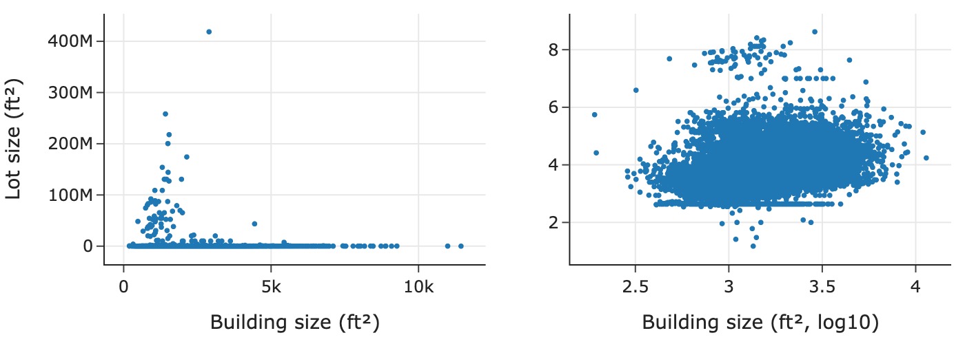
The scatter plot on the left is in the original units, which makes it difficult to discern the relationship because most of the points are crowded into the bottom of the plotting region. In contrast, the scatter plot on the right reveals a few interesting features: there is a horizontal line along the bottom of the scatter plot where it appears that many houses have the same lot size no matter the building size; and there appears to be a slight positive log–log linear association between lot and building size.
Let’s look at some lower quantiles of lot size to try and figure out this unusual value:
percs = [0.5, 1, 1.5, 2, 2.5, 3]
lots = np.percentile(sfh['lsqft'].dropna(), percs, method='lower')
pd.DataFrame({'lot_size': lots}, index=percs)
| lot_size | |
|---|---|
| 0.50 | 436.00 |
| 1.00 | 436.00 |
| 1.50 | 436.00 |
| 2.00 | 436.00 |
| 2.50 | 436.00 |
| 3.00 | 782.00 |
We found something interesting: about 2.5% of the houses have a lot size of 436 ft^2. This is tiny and makes little sense, so we make a note of the anomaly for further investigation.
Another measure of house size is the number of bedrooms. Since this is a discrete quantitative variable, we can treat it as a qualitative feature and make a bar plot.
Houses in the Bay Area tend to be on the smaller side, so we venture to guess that the distribution will have a peak at three and skew to the right with a few houses having five or six bedrooms. Let’s check:
br_cat = sfh['br'].value_counts().reset_index()
px.bar(br_cat, x="br", y="count", width=350, height=250,
       labels={'br':'Number of bedrooms'})

The bar plot confirms that we generally had the right idea. However, we find that there are some houses with over 30 bedrooms! That’s a bit hard to believe and points to another possible data quality problem. Since the records include the addresses of the houses, we can double-check theses values on a real estate app.
In the meantime, let’s just transform the number of bedrooms into an ordinal feature by reassigning all values larger than 8 to 8+, and re-create the bar plot with the transformed data:
eight_up = sfh.loc[sfh['br'] >= 8, 'br'].unique()
sfh['new_br'] = sfh['br'].replace(eight_up, 8)

br_cat = sfh['new_br'].value_counts().reset_index()
px.bar(br_cat, x="new_br", y="count", width=350, height=250,
       labels={'new_br':'Number of bedrooms'})

We can see that even if we lump all of the houses with 8+ bedrooms together, they do not amount to many. The distribution is nearly symmetric with a peak at 3, nearly the same proportion of houses have two or four bedrooms, and nearly the same have one or five. There is asymmetry present with a few houses having six or more bedrooms.
Now we examine the relationship between the number of bedrooms and sale price. Before we proceed, we save the transformations done thus far:
def log_vals(df):
    return df.assign(log_price=np.log10(df['price']),
                     log_bsqft=np.log10(df['bsqft']),
                     log_lsqft=np.log10(df['lsqft']))

def clip_br(df):
    eight_up = df.loc[df['br'] >= 8, 'br'].unique()
    new_br = df['br'].replace(eight_up, 8)
    return df.assign(new_br=new_br)

sfh = (sfh_df
 .pipe(subset)
 .pipe(log_vals)
 .pipe(clip_br)
)
Now we’re ready to consider relationships between the number of bedrooms and other variables.
10.6.4. Delving Deeper into Relationships#
Let’s begin by examining how the distribution of price changes for houses with different numbers of bedrooms. We can do this with box plots:
px.box(sfh, x='new_br', y='price', log_y=True, width=450, height=250,
      labels={'new_br':'Number of bedrooms','price':'Sale price (USD)'})

The median sale price increases with the number of bedrooms from one to five bedrooms, but for the largest houses (those with more than six bedrooms), the distribution of log-transformed sale price appears nearly the same.
We would expect houses with one bedroom to be smaller than houses with, say, four bedrooms. We might also guess that houses with six or more bedrooms are similar in size and price. To dive deeper, we consider a kind of transformation that divides price by building size to give us the price per square foot. We want to check if this feature is constant for all houses; in other words, price is primarily determined by size. To do this we look at the relationship between the two pairs of size and price, and price per square foot and size:
sfh = sfh.assign(
    ppsf=sfh['price'] / sfh['bsqft'],
    log_ppsf=lambda df: np.log10(df['ppsf']))
We create two scatter plots. The one on the left shows price against the building size (both log-transformed), and the plot on the right shows price per square foot (log-transformed) against building size. In addition, each plot has an added smooth curve that reflects the local average price or price per square foot for buildings of roughly the same size:
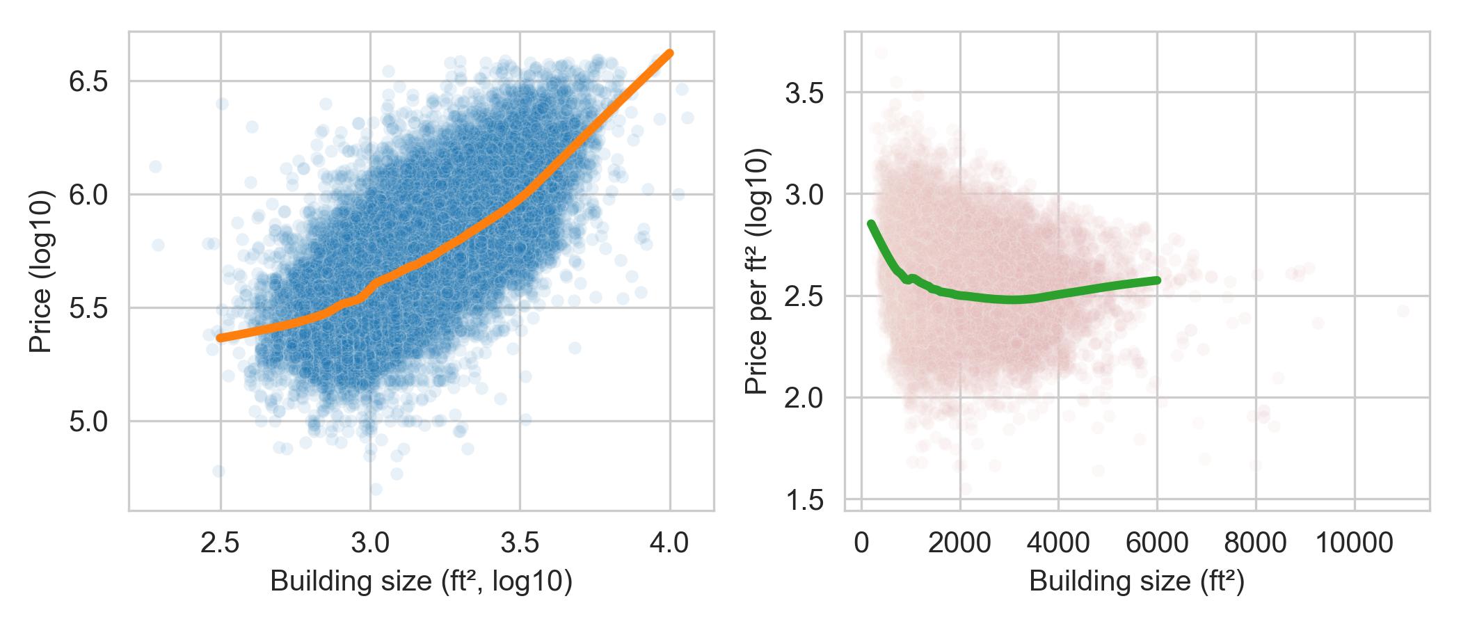
The lefthand plot shows what we expect—larger houses cost more. We also see that there is roughly a log–log association between these features.
The righthand plot in this figure is interestingly nonlinear. We see that
smaller houses cost more per square foot than larger ones, and the price per
square foot for larger houses is relatively flat.
This feature appears to be quite interesting, so we save the price per square foot transforms into sfh:
def compute_ppsf(df):
    return df.assign(
    ppsf=df['price'] / df['bsqft'],
    log_ppsf=lambda df: np.log10(df['ppsf']))

sfh = (sfh_df
 .pipe(subset)
 .pipe(log_vals)
 .pipe(clip_br)
 .pipe(compute_ppsf)
)
So far we haven’t considered the relationship between prices and location. There are house sales from over 150 different cities in this dataset. Some cities have a handful of sales and others have thousands. We continue our narrowing down of the data and examine relationships for a few cities next.
10.6.5. Fixing Location#
You may have heard the expression: there are three things that matter in real estate—location, location, location. Comparing prices across cities might bring additional insights to our investigation.
We examine data for some cities in the San Francisco East Bay: Richmond, El Cerrito, Albany, Berkeley, Walnut Creek, Lamorinda (which is a combination of Lafayette, Moraga, and Orinda, three neighboring bedroom communities), and Piedmont.
Let’s begin by comparing the distribution of sale price for these cities:
cities = ['Richmond', 'El Cerrito', 'Albany', 'Berkeley',
          'Walnut Creek', 'Lamorinda', 'Piedmont']

px.box(sfh.query('city in @cities'), x='city', y='price',
       log_y=True, width=450, height=250,
      labels={'city':'', 'price':'Sale price (USD)'})

The box plots show that Lamorinda and Piedmont tend to have more expensive homes and Richmond has the least expensive, but there is overlap in sale price for many cities.
Next, we examine the relationship between price per square foot and house size more closely with faceted scatter plots, one for each of four cities:
four_cities = ["Berkeley", "Lamorinda", "Piedmont", "Richmond"]
fig = px.scatter(sfh.query("city in @four_cities"),
    x="bsqft", y="log_ppsf", facet_col="city", facet_col_wrap=2,
    labels={'bsqft':'Building size (ft^2)',
            'log_ppsf': "Price per square foot"},
    trendline="ols", trendline_color_override="black",
)

fig.update_layout(xaxis_range=[0, 5500], yaxis_range=[1.5, 3.5],
                  width=450, height=400)
fig.show()

The relationship between price per square foot and building size is roughly log–linear with a negative association for each of the four locations. While, not parallel, it does appear that there is a “location” boost for houses, regardless of size, where, say, a house in Berkeley costs about $250 more per square foot than a house in Richmond. We also see that Piedmont and Lamorinda are more expensive cities, and in both cities, there is not the same reduction in price per square foot for larger houses in comparison to smaller ones. These plots support the “location, location, location” adage.
In EDA, we often revisit earlier plots to check whether new findings add insights to previous visualizations. It is important to continually take stock of our findings and use them to guide us in further explorations. Let’s summarize our findings so far.
10.6.6. EDA Discoveries#
Our EDA has uncovered several interesting phenomena. Briefly, some of the most notable are:
Sale price and building size are highly skewed to the right with one mode.
Price per square foot decreases nonlinearly with building size, with smaller houses costing more per square foot than larger houses and price per square foot being roughly constant for large houses.
More desirable locations add a bump in sale price that is roughly the same amount for houses of different sizes.
There are many additional explorations we can (and should) perform, and there are several checks that we should make. These include investigating the 436 value for lot size and cross-checking unusual houses, like the 30-bedroom house and the $20M house, with online real estate apps.
We narrowed our investigation down to one year and later to a few cities. This narrowing helped us control for features that might interfere with finding simple relationships. For example, since the data were collected over several years, the date of sale may confound the relationship between sale price and number of bedrooms. At other times, we want to consider the effect of time on prices. To examine price changes over time, we often make line plots, and we adjust for inflation. We revisit these data in Chapter 11 when we consider data scope and look more closely at trends in time.
Despite being brief, this section conveys the basic approach of EDA in action. For an extended case study on a different dataset, see Chapter 12.