Simple Linear Model
15.1. Simple Linear Model#
Like with the constant model, our goal is to approximate the signal in a feature by a constant. Now we have additional information from a second feature to help us. In short, we want to use information from a second feature to make a better model than the constant model. For example, we might describe the sale price of a house by its size or predict a donkey’s weight from its length. In each of these examples, we have an outcome feature (sale price, weight) that we want to explain, describe, or predict with the help of an explanatory feature (house size, length).
Note
We use outcome to refer to the feature that we are trying to model and explanatory for the feature that we are using to explain the outcome. Different fields have adopted conventions for describing this relationship. Some call the outcome the dependent variable and the other one the independent variable. Others use the pairs response and covariate; regressand and regressor; explained and explanatory; endogenous and exogenous. In machine learning, it is common to refer to the target and features or to the predicted and predictors. Unfortunately, many of these pairs connote a causal relationship. The notion of explaining or predicting is not necessarily meant to imply that one causes the other. Particularly confusing is the independent-dependent usage, and we recommend avoiding it.
One possible model we might use is a line. Mathematically, that means we have an intercept, \( \theta_0 \), and a slope, \( \theta_1 \), and we use the explanatory feature \(x\) to approximate the outcome, \( y \), by a point on the line:
As \(x\) changes, the estimate for \(y\) changes but still falls on the line. Typically, the estimate isn’t perfect, and there is some error in using the model; that’s why we use the symbol \(\approx\) to mean “approximately.”
To find a line that does a good job of capturing the signal in the outcome, we use the same approach introduced in Chapter 4 and minimize the average squared loss. Specifically, we follow these steps:
Find the errors: \( y_i - (\theta_0 + \theta_1 x_i), ~i=1, \ldots, n \)
Square the errors (i.e., use squared loss): \( [y_i - (\theta_0 + \theta_1 x_i)]^2 \)
Calculate the average loss over the data:
To fit the model, we find the slope and intercept that give us the smallest average loss; in other words, we minimize the mean square error, or MSE for short. We call the minimizing values for the intercept and slope, \( \hat{\theta}_0 \) and \( \hat{\theta}_1\).
Notice that the errors we calculate in step 1 are measured in the vertical direction, meaning for a specific \(x\), the error is the vertical distance between the data point \((x, y)\) and the point on the line \((x, \theta_0 + \theta_1 x)\). Figure 15.1 shows this notion. On the left is a scatter plot of points with a line used to estimate \(y\) from \(x\). We have marked two specific points by squares and their corresponding approximations on the line by diamonds. The dotted segment from the actual point to the line shows the error. The plot on the right is a scatter plot of all the errors; for reference, we marked the errors corresponding to the two square points in the left plot with squares in the right plot as well.
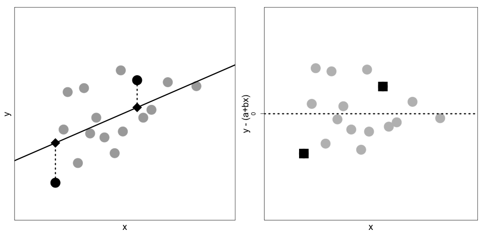
Fig. 15.1 On the left is a scatter plot of \((x_i, y_i)\) pairs and a line that we use to estimate \(y\) from \(x\). Two specific points are represented by squares and their estimates by diamonds. On the right is a scatter plot of the errors: \(y_i - (\theta_0 + \theta_1 x_i)\).#
Later in this chapter, we derive the values \( \hat{\theta}_0 \) and \( \hat{\theta}_1 \) that minimize the mean square error. We show that these are:
Here, \( {\mathbf{x}} \) represents the values \( x_1 , \ldots, x_n\) and \( {\mathbf{y}} \) is similarly defined; \( r({\mathbf{x}},{\mathbf{y}}) \) is the correlation coefficient of the \( (x_i , y_i ) \) pairs.
Putting the two together, the equation for the line becomes:
This equation has a nice interpretation: for a given \(x\) value, we find how many standard deviations above (or below) average it is, and then we predict (or explain, depending on the setting) \(y\) to be \(r\) times as many standard deviations above (or below) its average.
We see from the expression for the optimal line that the sample correlation coefficient plays an important role. Recall that \( r \) measures the strength of the linear association and is defined as:
Here are a few important features of the correlation that help us as we fit linear models:
\(r\) is unitless. Notice that \(x\), \(\bar{x}\), and \(SD({\mathbf{x}})\) all have the same units, so the following ratio has no units (and likewise for the terms involving \(y_i\)):
\(r\) is between \(-1\) and \(+1\). Only when all of the points fall exactly along a line is the correlation either \(+1\) or \(-1\), depending on whether the slope of the line is positive or negative.
\(r\) measures the strength of a linear association, not whether or not the data have a linear association. The four scatterplots in Figure 15.2 all have the same correlation coefficient of about \(0.8\) (as well as the same averages and SDs), but only one plot, the one on the top left, has what we think of as a linear association with random errors about the line.

Fig. 15.2 These four sets of points, known as Anscombe’s quartet, have the same correlation of 0.8, and the same means and standard deviations. The plot in the top left exhibits a linear association; top right shows a perfect nonlinear association; bottom left, with the exception of one point, is a perfect linear association; and bottom right, with the exception of one point, has no association.#
Again, we do not expect the pairs of data points to fall exactly along a line, but we do expect the scatter of points to be reasonably described by the line, and we expect that the deviations between \(y_i\) and the estimate \(\hat{\theta}_0 + \hat{\theta}_1 x_i\) to be roughly symmetrically distributed about the line with no apparent patterns.
Linear models were introduced in Chapter 12 where we used the relationship between measurements from high-quality air monitors operated by the Environmental Protection Agency and neighboring inexpensive air quality monitors to calibrate the inexpensive monitors for more accurate predictions. We revisit that example to make the notion of a simple linear model more concrete.